Brand Strategy & Positioning
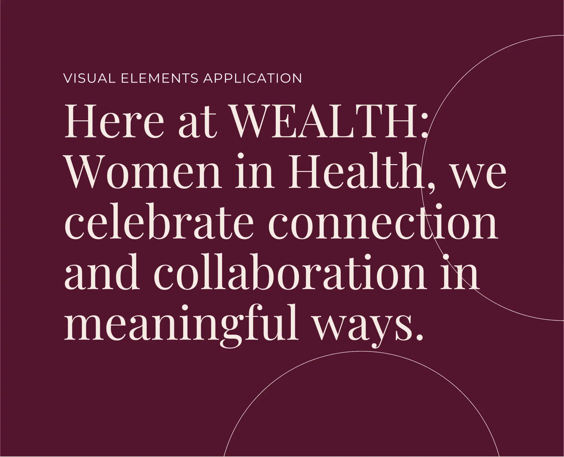
WEALTH was built on the principles of collaboration, mentorship, and innovation, redefining “wealth” not as a financial measure but as a shared resource of insight, belonging, and impact. The brand needed to resonate with scientists, founders, investors, and industry leaders, while maintaining warmth and inclusivity.
Our strategy bridged the analytical precision of the health and biotech sectors with the emotional intelligence and connection that underpin women’s communities, creating a purpose-driven identity that speaks to both intellect and heart.
Visual Identity Design
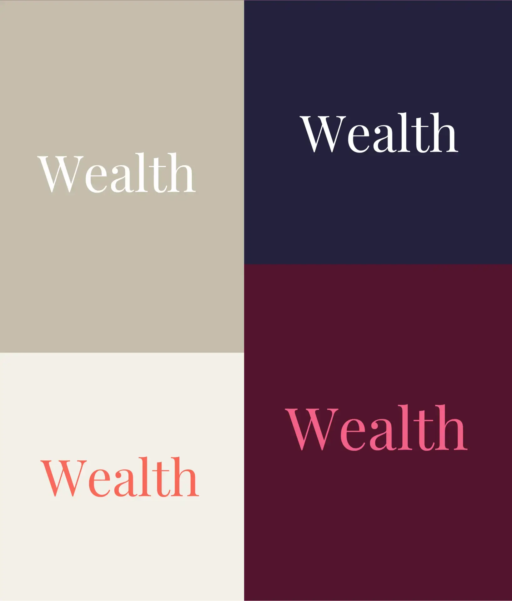
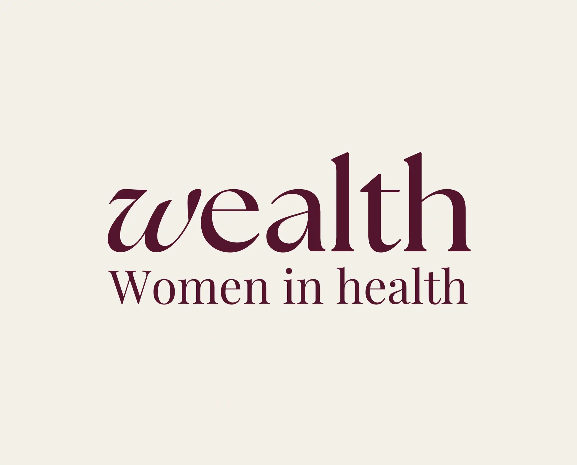
The resulting identity system is layered, elegant, and versatile, reflecting both the complexity of the health sector and the interpersonal strength of the community. Clean, organic logo forms signal unity and growth, visually capturing connection across disciplines. A confident serif paired with a modern sans-serif balances credibility with approachability, while a palette of rich purples, warm neutrals, and vibrant accents conveys leadership, energy, and diversity. The modular graphic system ensures the brand translates seamlessly across digital, print, and event materials.
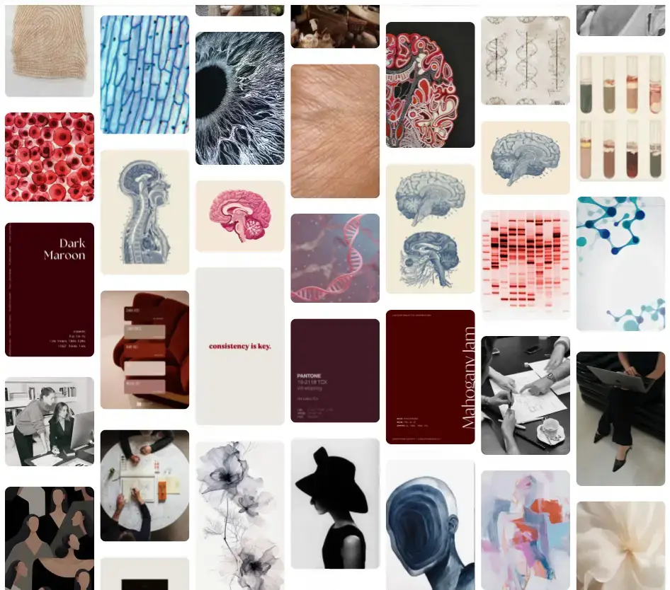
Social Media Direction
To shape the brand’s digital storytelling, we created a thoughtfully curated moodboard, providing a consistent visual and tonal framework across platforms and campaigns. The tone of voice is empowering, sincere, and insight-driven, while the content highlights women’s stories, event moments, mentorship experiences, and innovations in health. Every layout, image, and reference has been carefully considered to guide the visual language and post structure, ensuring a cohesive and instantly recognisable presence online.