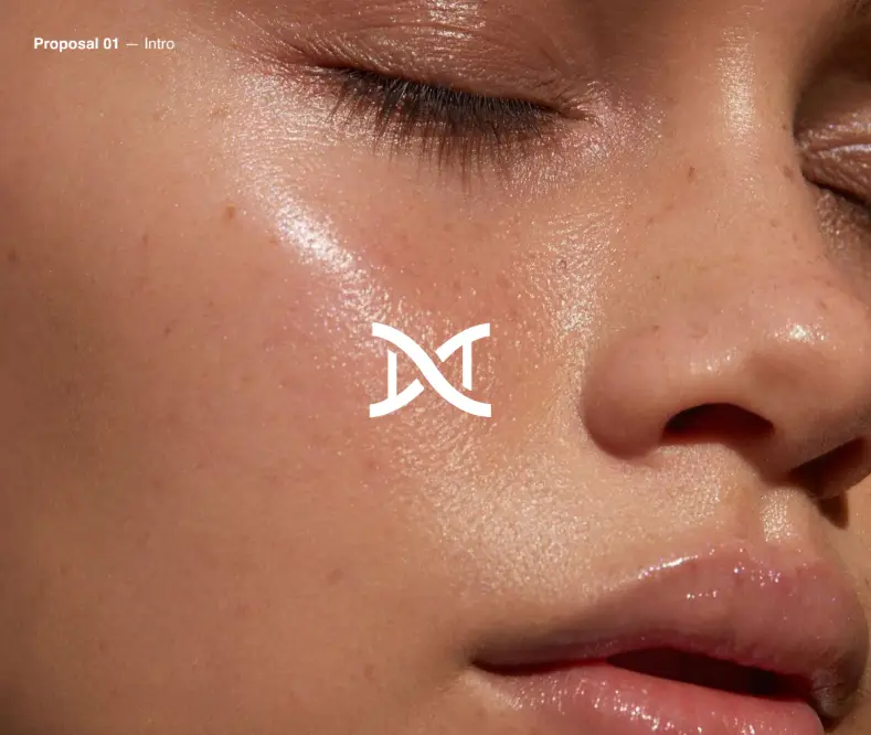
We collaborated with an innovative longevity initiative to shape the brand identity for Smart Aging, a concept redefining the way we perceive ageing. At its core, the brand champions a progressive philosophy: ageing is not a decline, but a tailored journey towards vitality, wellbeing, and refined aesthetics.
From initial idea through to a fully realised brand ecosystem, we established Smart Aging as a premium, science-driven authority in health optimisation and wellness. Our work spanned brand strategy, visual identity, tone of voice, messaging, typography, and a suite of bespoke digital assets designed for social platforms.
The project sits at the intersection of longevity, personalised healthcare, and lifestyle innovation, the brand narrative brings clarity and purpose to a fast-moving, transformative field.
The goal was to build a forward-looking health and wellness brand that communicates the benefits of ageing intelligently – through personalised science, preventative care, and aesthetic wellbeing.
Our objectives were to:
Redefine ageing through a science-backed, optimistic brand narrative
Develop a distinctive and adaptable identity within the longevity space
Balance credibility with elegance to resonate with both medical professionals and wellness-driven consumers
Design a flexible system that performs seamlessly across digital platforms and offline touchpoints
This project demanded the precision and rigour of health and science branding, combined with the emotional intelligence and refinement of a lifestyle experience.
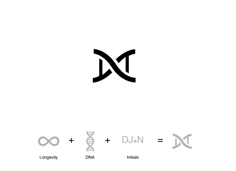
We developed a clear, strategic direction that unites biology, personalisation, and longevity within a cohesive premium identity. The symbol brings together three core elements:
The infinity symbol representing longevity and vitality,
The DNA strand, reflecting personalised, science-based health
The founders’ initials – brought together in a distinctive monogram
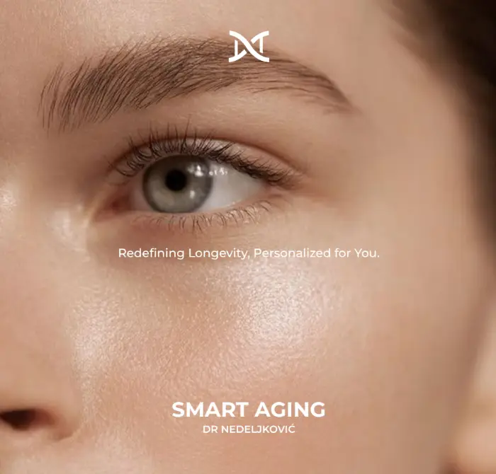
Balancing organic fluidity with structural precision, the logo is conceptually rich yet instantly recognisable. It anchors the brand with authority, while communicating both longevity and personalised healthcare at the heart of a science-led identity.
Extending beyond the symbol, we designed a comprehensive identity system that expresses clarity, sophistication, and adaptability. From typography and colour palette to digital applications, every element was crafted to reflect the brand’s premium positioning while remaining versatile across both physical and digital touchpoints.
The Smart Aging brand voice is expert, encouraging, and forward-looking. It speaks with clarity and warmth, offering scientifically grounded guidance in a way that is both aspirational and accessible to a discerning audience.
Core Brand Messaging:
Longevity, designed around your unique needs
Ageing smartly, with personalised science at the core
Unlocking vitality at every stage of life.
This narrative positions Smart Aging as a leader in a new category – where digital health, personal wellbeing, and scientific credibility converge.
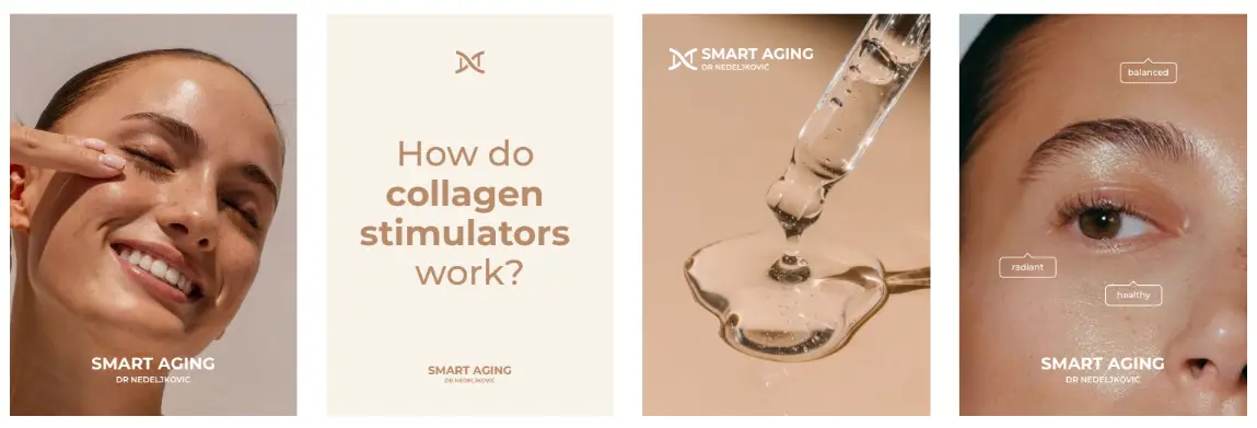
To establish a confident digital presence, we created a suite of tailored social assets. Each visual and piece of content reflects the same precision as the core identity, ensuring consistency while engaging audiences with clarity and inspiration. The result is a digital experience that educates, empowers, and reinforces the brand’s authority across platforms.
The outcome is a cohesive, elevated brand system that positions Smart Aging as a trusted authority in the emerging field of science-led health and longevity. It communicates a personalised, empowering approach to ageing – aspirational in tone yet grounded in scientific credibility.
Key outcomes:
A scalable, premium brand identity for a longevity-focused health concept
A distinctive voice and visual system for digital health communication
A toolkit for seamless application across web, social, and offline channels
The result is a brand that feels authentic, purposeful, and immediately recognisable.